
Exploratory Data Analysis & Correlations
What you’ll learn
Section titled “What you’ll learn”- why you explore a copy of the training set and nothing else
- the Pearson correlation formula, computed by hand on five points
- the two things correlation is blind to, and the plot that exposes both
- how to spot data-quality artefacts that a summary statistic hides completely
- three engineered ratios, two of which outrank every raw count in the dataset
- the difference between a feature that correlates and a feature that helps
Intuition
Section titled “Intuition”The test set is locked away, so now you can be as aggressive as you like — but on a copy, so that experiments do not damage the training data itself.
Exploration has one goal: find the structure a model can use, and the defects that will mislead it.
Both of those live in plots more often than in statistics. describe() cannot tell you that two
columns are latitude and longitude; a scatter plot draws California in three seconds.
housing = strat_train_set.copy() # never explore the original, never touch the test setThe math: Pearson correlation
Section titled “The math: Pearson correlation”The numerator is the covariance — how the two vary together. The denominator normalises it by both spreads, so is dimensionless and confined to . Because it is scale-free, the correlation between income and price is unchanged whether price is in dollars or thousands.
measures exactly one thing: the strength of a linear relationship. That precision is what makes it useful and what makes it dangerous.
Worked example by hand
Section titled “Worked example by hand”Five districts. Income in tens of thousands, value in hundreds of thousands.
| product | |||||||
|---|---|---|---|---|---|---|---|
| 1 | 2 | 1 | −2 | −2 | 4 | 4 | 4 |
| 2 | 3 | 2 | −1 | −1 | 1 | 1 | 1 |
| 3 | 4 | 4 | 0 | +1 | 0 | 0 | 1 |
| 4 | 5 | 4 | +1 | +1 | 1 | 1 | 1 |
| 5 | 6 | 4 | +2 | +1 | 2 | 4 | 1 |
| 8 | 10 | 8 |
A strong positive linear relationship. Note what the arithmetic did: it never looked at the shape of the relationship, only at whether and deviate from their means in the same direction.
And . For a simple linear regression of on , the squared correlation is exactly the from Metrics R-Squared. Two chapters, one number.
Geography for free
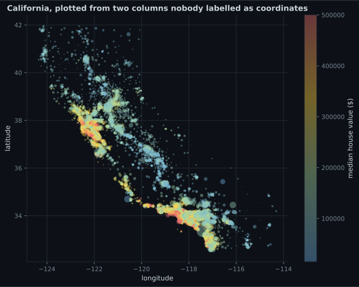
Section titled “Geography for free”housing.plot(
kind="scatter", x="longitude", y="latitude", alpha=0.4,
s=housing["population"] / 100, label="population",
c="median_house_value", cmap="jet", colorbar=True, figsize=(10, 7),
)
Reading the plot
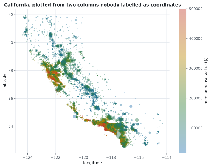
Section titled “Reading the plot”- Price follows the coast. Density and coastal proximity together explain far more than either
alone — which is why
ocean_proximity, the text column, turns out to matter. - Two bright clusters are the Bay Area and greater Los Angeles. A
distance_to_nearest_cityfeature is visible here and available nowhere in the raw columns. - The interior is uniformly cheap. That is the
INLANDcategory, and it becomes the second most important feature in the final model. - Point size shows population, and the largest circles sit in the bright clusters. Correlated predictors, which matters when interpreting coefficients later.
What correlation cannot see
Section titled “What correlation cannot see”corr = housing.select_dtypes("number").corr()
print(corr["median_house_value"].sort_values(ascending=False).round(4).to_string())
# median_house_value 1.0000
# median_income 0.6881
# total_rooms 0.1342
# housing_median_age 0.1056
# households 0.0658
# total_bedrooms 0.0497
# population -0.0246
# longitude -0.0460
# latitude -0.1442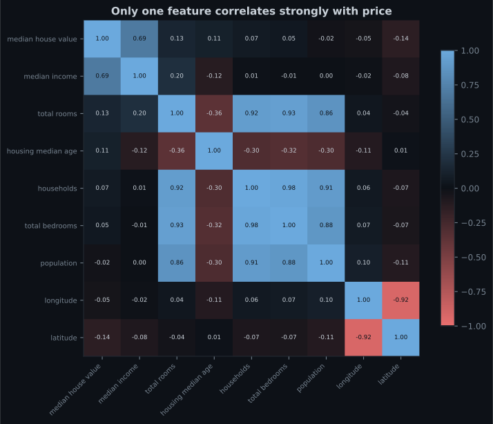
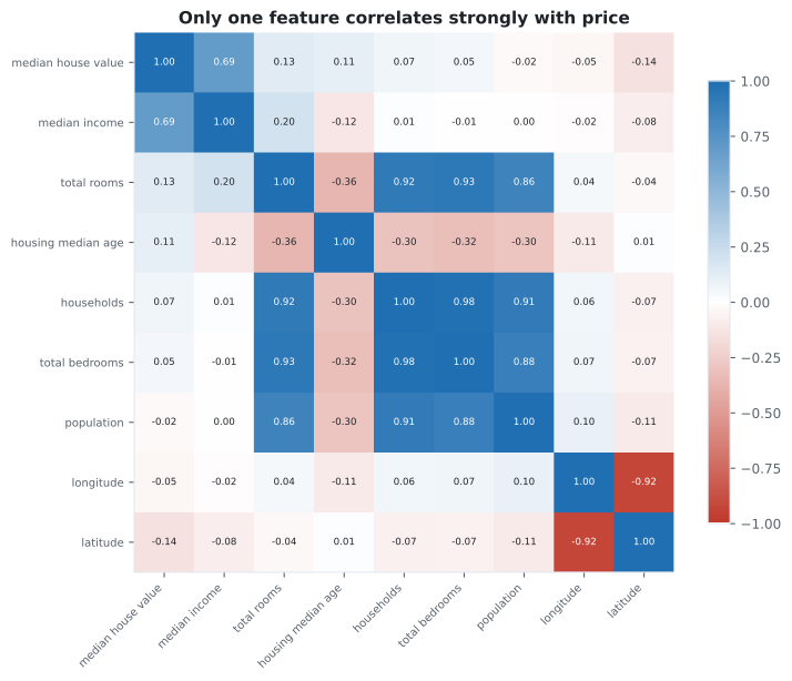
Two blind spots matter here:
It only sees straight lines. A perfect parabola over symmetric has . Correlation zero does not mean “no relationship”, it means “no linear relationship”.
It only sees pairs. Latitude scores −0.14 and longitude −0.05, both apparently useless. The map above shows they are jointly among the strongest signals in the dataset. No pairwise statistic can find that, and in the final model latitude and longitude are the third and fourth most important features.
Reading the plot
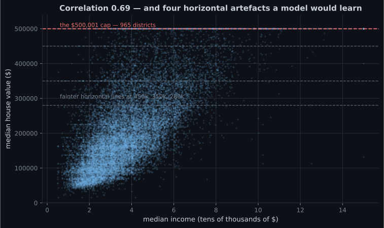
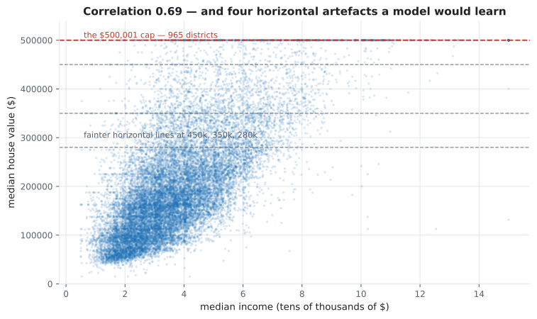
Section titled “Reading the plot”- The upward trend is genuine, and describes it fairly.
- The line at is the cap: 965 districts.
- Three fainter lines near 450k, 350k and 280k are also artefacts. Nobody documented these; only the scatter reveals them.
- The cloud fans out as income rises — heteroscedasticity, which does not bias the fit but does make uniform confidence intervals wrong.
A model trained on this data will reproduce those horizontal lines, because they are in the labels. Removing the capped districts is the honest fix, and it changes what the model is for.
What to do with a correlation number
Section titled “What to do with a correlation number”A coefficient on its own is never an instruction. The number tells you which plot to draw next, and the plot tells you what to do:
  flowchart TD
  A["r for one column against the target"] --> B{"Is r large in
absolute value?"}
  B -->|"yes, e.g. income 0.69"| C["Scatter it against the target"]
  C --> D{"Straight cloud,
no stripes or walls?"}
  D -->|"clean"| E["Keep the column.
r describes it fairly."]
  D -->|"horizontal lines,
hard cap"| F["Recording artefact.
Drop capped rows or
reframe the target."]
  D -->|"fans out as x grows"| G["Heteroscedastic.
Fit is fine; uniform
intervals are not."]
  B -->|"no, e.g. latitude -0.14"| H{"Could it matter
jointly with another column?"}
  H -->|"geography, dates,
counts that scale together"| I["Plot the pair, or plot it
coloured by the target"]
  I --> J["Engineer a ratio,
interaction or cluster feature,
then re-measure r"]
  H -->|"no reason to expect it"| K{"Curved relationship
in the scatter?"}
  K -->|"yes, parabola"| L["r is blind here.
Use mutual information
or Spearman."]
  K -->|"no"| M["Genuinely weak.
Leave it in and let
the model decide."]
Every branch that ends in an action starts with a plot. That is the whole argument for EDA: the coefficient is a routing decision, not a conclusion.
See it move
Section titled “See it move”The cloud below rotates and tightens while is recomputed live. Watch what happens when the relationship becomes a parabola: the points are perfectly determined and collapses to zero.
Engineering features
Section titled “Engineering features”Raw counts in this dataset are nearly meaningless: total_rooms mostly measures how large a
district is, not how desirable. Ratios fix that by dividing out district size.
housing["rooms_per_household"] = housing["total_rooms"] / housing["households"]
housing["bedrooms_per_room"] = housing["total_bedrooms"] / housing["total_rooms"]
housing["population_per_household"] = housing["population"] / housing["households"]

corr = housing.select_dtypes("number").corr()
print(corr["median_house_value"].sort_values(ascending=False).round(4).to_string())

# median_house_value          1.0000
# median_income               0.6881
# rooms_per_household         0.1519
# total_rooms                 0.1342
# housing_median_age          0.1056
# households                  0.0658
# total_bedrooms              0.0497
# population_per_household   -0.0237
# population                 -0.0246
# longitude                  -0.0460
# latitude                   -0.1442
# bedrooms_per_room          -0.2559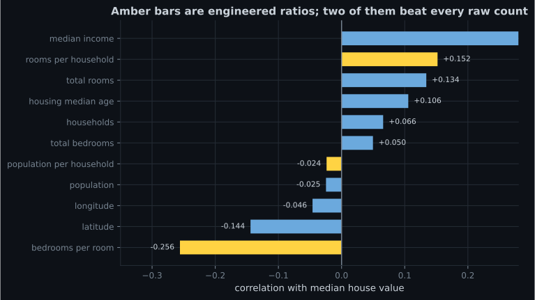
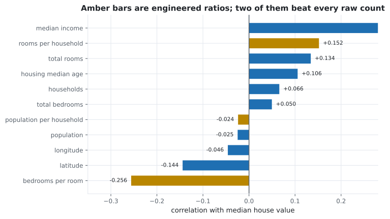
bedrooms_per_room is the win. A low ratio means larger, more expensive homes — the raw
total_bedrooms correlation of 0.05 was measuring district size and hiding this entirely. Two
columns that individually say almost nothing produce, on division, the second-strongest signal in
the dataset.
This is what feature engineering is: not more data, but the same data in a form that exposes the relationship.
Pitfalls
Section titled “Pitfalls”-
A feature has correlation 0.00 with the target. What can you conclude?
Pearson r measures linear association only. A perfect parabola over symmetric x scores exactly zero while being fully deterministic.
pch.quizShowAnswer
B — There is no linear relationship — a curved or threshold relationship may still be strong — Pearson r measures linear association only. A perfect parabola over symmetric x scores exactly zero while being fully deterministic.
-
Latitude scores -0.14 and longitude -0.05 against price, yet both are among the most important features in the final model. Why?
Neither coordinate alone predicts price. Together they specify a location, and location is what determines price. No pairwise measure can express that.
pch.quizShowAnswer
B — Correlation is pairwise; the signal lives in the interaction between the two, which is visible on a map and invisible to any single-column statistic — Neither coordinate alone predicts price. Together they specify a location, and location is what determines price. No pairwise measure can express that.
-
bedrooms_per_room correlates -0.256 while its two source columns manage 0.05 and 0.13. What happened?
Both raw columns mostly measure how big a district is. Their ratio cancels that out and exposes a property of the housing stock itself.
pch.quizShowAnswer
B — Dividing out district size turned two size measurements into a measure of home layout, which is what actually relates to price — Both raw columns mostly measure how big a district is. Their ratio cancels that out and exposes a property of the housing stock itself.
-
Why explore a copy of the training set rather than the training set itself?
Exploration involves destructive experiments. A copy means you can be reckless without a silent mutation surviving into training.
pch.quizShowAnswer
B — So that experimental transformations — dropped rows, new columns, imputed values — cannot corrupt the data you will actually train on — Exploration involves destructive experiments. A copy means you can be reckless without a silent mutation surviving into training.
🧪 Try It Yourself
Section titled “🧪 Try It Yourself”Exercise 1 – Correlation by hand
Section titled “Exercise 1 – Correlation by hand”Exercise 2 – Sort correlations against the target
Section titled “Exercise 2 – Sort correlations against the target”Exercise 3 – Engineer the winning ratio
Section titled “Exercise 3 – Engineer the winning ratio”Exercise 4 – Correlation is blind to curves
Section titled “Exercise 4 – Correlation is blind to curves”Exercise 5 – Find the recording artefacts
Section titled “Exercise 5 – Find the recording artefacts”- Explore a copy of the training set. The test set stays closed.
- , dimensionless and bounded by ; worked by hand it gives 0.8944, and is the simple-regression .
- Correlation sees only straight lines and only pairs. Latitude and longitude prove both limitations at once.
- Plotting two unlabelled columns drew a map, and the map showed that price follows the coast.
- The income scatter exposes a hard cap at $500,001 and three fainter recording artefacts.
- Three ratios:
bedrooms_per_roomreaches −0.256, second only to income and stronger than every raw count.
Exercise 6 – The coefficient that sees curves, and the one that does not
Section titled “Exercise 6 – The coefficient that sees curves, and the one that does not”Continue to
Data Cleaning & Handling Missing Values
— deal with the 207 holes in total_bedrooms, and measure whether the choice of strategy actually
changes anything.
pch.coffeeTagline
pch.coffeeCtapch.feedbackHeading
pch.feedbackSubheading