
Partial Dependence and ICE Plots
What you’ll learn
Section titled “What you’ll learn”- what a partial dependence plot actually computes, and what it assumes
- the failure: PDP range 0.8011 where the true effect spans −9.02 to +8.57
- ICE plots, which show one curve per row instead of the average
- centred ICE, which separates each curve’s shape from its starting level
- why PDP extrapolates into regions where no data exists
- the
method="brute"/method="recursion"difference, and why it matters here - when to trust the average and when it is actively lying to you
From importance to direction
Section titled “From importance to direction”Feature importance tells you a feature matters. It does not tell you how. Does more income raise the prediction or lower it? Is the relationship linear, a step, a U-shape?
A partial dependence plot answers that. Pick a feature, sweep it across its range, and for each value ask: what would the model predict, on average, if every row had that value?
where is the feature you are varying and is everything else, kept at each row’s actual values. In words: replace the feature with a fixed value for every row, predict, average. Then repeat for the next value on the grid.
That averaging is the whole method, and it is also the whole problem.
The failure
Section titled “The failure”Here is a dataset with two features. x is continuous. group is binary — and group flips the
sign of x’s effect:
A random forest learns this correctly; it has no trouble with it. Now plot the partial dependence
of x.
| Measurement | Value |
|---|---|
| PDP total range across the whole sweep | 0.8011 |
Mean ICE slope for group = 0 rows | −9.0235 |
Mean ICE slope for group = 1 rows | +8.5737 |
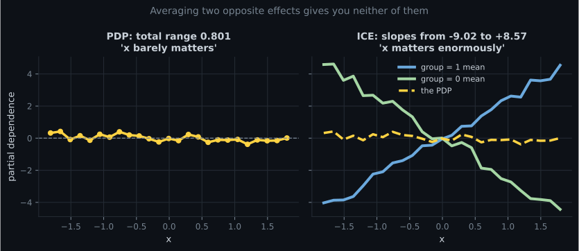
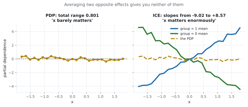
Read the left panel as a stakeholder would: “x doesn’t really matter.” It is the single most important feature in the dataset, its effect is enormous, and the plot says nothing is happening.
The PDP is not buggy. It computed exactly what it promises — the average effect — and the average happens to be near zero. The problem is that “the average effect” was the wrong question.
ICE plots
Section titled “ICE plots”An Individual Conditional Expectation plot performs the same sweep but skips the averaging. One curve per row:
With method="brute" the PDP is precisely the pointwise mean of the ICE curves, so you lose nothing
by plotting them and you gain the entire distribution.
from sklearn.inspection import partial_dependence

avg = partial_dependence(model, X, features=["x"], kind="average")     # the PDP
ind = partial_dependence(model, X, features=["x"], kind="individual")  # ICE curves
both = partial_dependence(model, X, features=["x"], kind="both")       # both at once
Use kind="both" by default. It makes heterogeneity impossible to miss.
One caveat: brute against recursion
Section titled “One caveat: brute against recursion”The claim “the PDP is the mean of the ICE curves” is true for method="brute" and not true for
method="recursion" — and for tree ensembles, method="auto" picks recursion.
The recursion method walks the tree structure instead of substituting values into real rows. It is
much faster, and it weights by the training distribution recorded at each node rather than by your
actual data. The two disagree:
method | PDP range on this data | Equals mean of ICE? |
|---|---|---|
"recursion" (the default for forests) | 1.0352 | no |
"brute" | 0.8011 | yes, exactly |
import numpy as np
from sklearn.inspection import partial_dependence

rec = partial_dependence(model, X, features=["x"], method="recursion",
                         grid_resolution=25)["average"][0]
brute = partial_dependence(model, X, features=["x"], method="brute",
                           kind="both", grid_resolution=25)

print(np.allclose(brute["individual"][0].mean(axis=0), brute["average"][0]))  # True
print(round(float(rec.max() - rec.min()), 4))                    # 1.0352
print(round(float(brute["average"][0].ptp()), 4))                # 0.8011
Neither is wrong, but they answer slightly different questions, and only brute is the one the
formula above describes. Every number on the rest of this page uses method="brute" so that the
PDP and the ICE curves are guaranteed to be consistent with each other.
Centred ICE
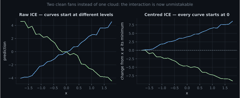
Section titled “Centred ICE”Raw ICE curves start at different heights, because each row has different values for the other features. That vertical spread is real but it obscures the shapes, which is what you are looking at the plot to see.
Centred ICE subtracts each curve’s own value at the left edge of the grid:
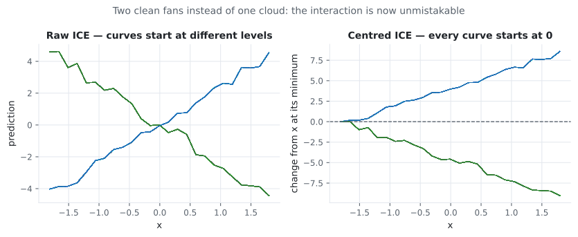
Every curve now starts at zero, so what you see is purely how much the prediction changes.
ice = partial_dependence(model, X, features=["x"], kind="individual")
curves = ice["individual"][0]
centred = curves - curves[:, [0]]        # subtract each row's own starting value
sklearn will do it for you in the display API:
from sklearn.inspection import PartialDependenceDisplay

PartialDependenceDisplay.from_estimator(
    model, X, features=["x"], kind="both", centered=True,
)
See it move
Section titled “See it move”The cancellation is pure arithmetic, so it can be watched directly. Below are forty ICE curves with a slope of either or ; the amber line is their average, which is what a PDP reports. Drag to change the mix.
At an even mix the PDP is exactly flat while every individual curve still climbs or falls by 10 units across the sweep. Nothing is hidden by noise or by a modelling choice; the average of and is 0, and that is the entire failure. The ICE spread, on the right of the readout, never changes — which is why it is the number to look at.
What PDP assumes, and when it breaks
Section titled “What PDP assumes, and when it breaks”The formula replaces feature with a fixed value while leaving at each row’s real values. That means it evaluates the model at combinations that may never occur in reality.
Consider age and years_of_experience. Sweeping age to 22 while a row keeps 30 years of
experience asks the model about a 22-year-old with 30 years of experience. The model will answer.
The answer is meaningless, and it goes into your average.
| Assumption | What breaks it | Consequence |
|---|---|---|
| Features are independent | Correlated features | PDP evaluates impossible rows |
| The effect is homogeneous | Interactions | PDP averages opposite effects to zero |
| The grid stays in-distribution | Skewed features | Extrapolation into empty regions |
Two mitigations worth knowing:
Plot the data distribution alongside the curve. A rug plot or histogram on the x-axis shows where the grid has support. sklearn’s display does this automatically. If the curve does something dramatic in a region with three data points, ignore it.
For correlated features, use ALE plots instead. Accumulated Local Effects average local
differences within narrow bins of the feature, so they never evaluate combinations that do not
occur. They are not in scikit-learn; alibi and PyALE implement them.
Reading a PDP safely
Section titled “Reading a PDP safely”The checks are cheap and the failure they prevent is expensive — a confident statement about a curve that was averaged out of impossible rows:
  flowchart TD
  A["You have a PDP curve"] --> B{"Did you plot the ICE
curves underneath it?"}
  B -->|"no"| B2["Do that first.
The average alone cannot
tell flat from cancelling."]
  B2 --> B
  B -->|"yes"| C{"Do the ICE curves
mostly agree in shape?"}
  C -->|"they fan apart or
cross each other"| D["Interaction present.
The PDP average is a
summary of disagreement."]
  D --> E["Condition on the interacting
feature, or draw a
two-feature PDP surface."]
  C -->|"parallel, same shape"| F{"Is the swept feature
correlated with others?"}
  F -->|"yes, above ~0.7"| G["PDP is evaluating rows
that cannot exist.
Use ALE instead."]
  F -->|"no"| H{"Does the dramatic part of
the curve have data support?"}
  H -->|"few rows there --
check the rug plot"| I["Extrapolation.
Ignore that region;
do not quote it."]
  H -->|"well supported"| J["Safe to report:
direction, magnitude,
and the range it holds over."]
The first box is not a formality. A perfectly flat PDP is produced both by a feature the model ignores and by a feature that helps half the population and hurts the other half — and only the ICE curves distinguish them. Everything else on this page is downstream of that one check.
Two-feature PDP
Section titled “Two-feature PDP”Passing a tuple of two features gives a surface, which is how you see an interaction directly rather than inferring it from a fan of ICE curves:
from sklearn.inspection import PartialDependenceDisplay

# One-way plots for each, then the interaction surface.
PartialDependenceDisplay.from_estimator(
    model, X,
    features=["x", "group", ("x", "group")],
    kind="average",
)
For the dataset above the surface is a saddle: rising in x on one half of group, falling on the
other. That is what a sign-flip interaction looks like, and it is invisible in either one-way plot.
Note the cost. A two-way PDP over a grid requires predictions. At and that is 25 million model calls, which is why you subsample:
PartialDependenceDisplay.from_estimator(
    model, X.sample(500, random_state=0),      # subsample rows
    features=[("x", "group")], grid_resolution=20,
)
In code
Section titled “In code”The whole comparison:
import numpy as np
import pandas as pd
from sklearn.ensemble import RandomForestRegressor
from sklearn.inspection import partial_dependence

rng = np.random.default_rng(3)
n = 2000
x = rng.uniform(-2, 2, n)
group = rng.integers(0, 2, n)
y = np.where(group == 1, 2.5 * x, -2.5 * x) + rng.normal(0, 0.4, n)

X = pd.DataFrame({"x": x, "group": group})
model = RandomForestRegressor(n_estimators=300, random_state=0).fit(X, y)

both = partial_dependence(model, X, features=["x"], grid_resolution=25,
                          kind="both", method="brute")
pdp = both["average"][0]
print(f"PDP total range: {pdp.max() - pdp.min():.4f}")        # 0.8011

ice = both["individual"][0]
slopes = ice[:, -1] - ice[:, 0]                # rise across the whole grid
g = X["group"].to_numpy()
print(f"ICE slope, group 0: {slopes[g == 0].mean():+.4f}")     # -9.0235
print(f"ICE slope, group 1: {slopes[g == 1].mean():+.4f}")     # +8.5737
print(f"ICE slope range:    {slopes.min():+.4f} to {slopes.max():+.4f}")
A cheap automated heterogeneity check worth putting in a report:
import numpy as np
from sklearn.inspection import partial_dependence


def heterogeneity(model, X, feature, grid_resolution=25):
    """Ratio of ICE slope spread to the PDP's own range.

    Large means the average is hiding structure and you must look at the ICE
    curves before saying anything about this feature.
    """
    both = partial_dependence(model, X, features=[feature],
                              grid_resolution=grid_resolution, kind="both",
                              method="brute")
    pdp = both["average"][0]
    curves = both["individual"][0]
    slopes = curves[:, -1] - curves[:, 0]
    pdp_range = float(pdp.max() - pdp.min())
    return {
        "pdp_range": round(pdp_range, 4),
        "ice_slope_spread": round(float(slopes.max() - slopes.min()), 4),
        "ratio": round(float(slopes.max() - slopes.min()) / max(pdp_range, 1e-9), 2),
        "sign_disagreement": float((slopes > 0).mean()),
    }


print(heterogeneity(model, X, "x"))
# {'pdp_range': 0.8011, 'ice_slope_spread': 17.5972, 'ratio': 21.97,
#  'sign_disagreement': 0.495}
sign_disagreement near 0.5 is the loudest possible warning: half the rows move up and half move
down, so no single number can describe this feature’s effect.
Pitfalls
Section titled “Pitfalls”Reading a PDP without looking at ICE. Measured: a PDP range of 0.8011 on a feature whose real effect spans 17.60 in slope.
Leaving method at its default and then claiming the PDP is the mean of the ICE curves. For tree
ensembles the default is "recursion", and it is not.
Using PDP on correlated features. It evaluates the model on combinations that never occur — 22-year-olds with 30 years of experience — and averages the results in.
Ignoring where the data actually is. A dramatic curve over a region with a handful of points is extrapolation, not a finding. Plot the rug.
Forgetting to centre ICE. Uncentred curves overlap into a band and the shapes get lost.
Computing a two-way PDP on the full dataset. predictions. Subsample the rows.
Treating a PDP as causal. It is a statement about the model, not the world. “If we raised everyone’s income the prediction would go up” is not what a PDP licenses — the model learned correlations, and intervening on income changes other things too.
Plotting PDP for a model that does not work. As with importance, if the model is at baseline the curves describe noise.
- PDP answers “what is the average effect of this feature?” by replacing it with a fixed value for every row and averaging the predictions.
- Averaging is the method and the flaw: a PDP range of 0.8011 on a feature whose per-row slopes run −9.02 to +8.57.
- ICE plots one curve per row; with
method="brute"the PDP is exactly their pointwise mean. Usekind="both", method="brute". - Centred ICE removes the vertical offset from other features so the shapes are comparable.
- PDP assumes feature independence and will happily evaluate impossible rows. Use ALE when features are correlated.
sign_disagreementnear 0.5 means no single-number summary of the effect exists.- A PDP describes the model, not the world. It is not a causal claim.
-
A PDP for your most important feature is almost flat. What should you check before reporting that the feature has little effect?
Measured on this page: a PDP range of 0.8011 for a feature whose per-row slopes ran from -9.02 to +8.57. A flat PDP is consistent with 'no effect' AND with 'two large opposite effects', and only the ICE curves distinguish them.
pch.quizShowAnswer
B — The ICE curves — the average of a positive and a negative effect is near zero — Measured on this page: a PDP range of 0.8011 for a feature whose per-row slopes ran from -9.02 to +8.57. A flat PDP is consistent with 'no effect' AND with 'two large opposite effects', and only the ICE curves distinguish them.
-
What is the exact relationship between a PDP and the ICE curves?
Which is why kind="both" costs nothing extra. Note the caveat: this identity only holds for method="brute". For tree ensembles sklearn defaults to method="recursion", which computes the average a different way and does NOT equal the mean of the ICE curves.
pch.quizShowAnswer
B — With method='brute' the PDP is the pointwise mean of the ICE curves — you get it for free when you compute them — Which is why kind="both" costs nothing extra. Note the caveat: this identity only holds for method="brute". For tree ensembles sklearn defaults to method="recursion", which computes the average a different way and does NOT equal the mean of the ICE curves.
-
Why is a PDP unreliable when features are correlated?
The model returns a prediction for those impossible rows and it goes straight into the average. ALE plots avoid this by averaging local differences within narrow bins, so they only ever use combinations that actually appear.
pch.quizShowAnswer
B — It fixes one feature while leaving the others at their real values, so it evaluates combinations that never occur — like a 22-year-old with 30 years of experience — The model returns a prediction for those impossible rows and it goes straight into the average. ALE plots avoid this by averaging local differences within narrow bins, so they only ever use combinations that actually appear.
-
What does centring ICE curves at the leftmost grid point accomplish?
Raw ICE curves start at different heights because the other features differ per row, and that spread hides the shapes. After centring, every curve starts at zero and shows purely the change in prediction.
pch.quizShowAnswer
B — It removes the vertical offset caused by each row's other features, so you can compare the shapes — Raw ICE curves start at different heights because the other features differ per row, and that spread hides the shapes. After centring, every curve starts at zero and shows purely the change in prediction.
-
Your heterogeneity check reports sign_disagreement = 0.5. What does that mean?
It is the strongest possible interaction signal for this feature. Reporting one direction would be wrong for half your population, so the honest output is a segmented analysis rather than a single curve.
pch.quizShowAnswer
B — Half the rows have a rising effect and half falling — no single summary of this feature's effect is valid — It is the strongest possible interaction signal for this feature. Reporting one direction would be wrong for half your population, so the honest output is a segmented analysis rather than a single curve.
🧪 Try It Yourself
Section titled “🧪 Try It Yourself”Exercise 1 – Compute a PDP by hand
Section titled “Exercise 1 – Compute a PDP by hand”Exercise 2 – Measure the range the PDP reports
Section titled “Exercise 2 – Measure the range the PDP reports”Exercise 3 – Let ICE contradict the PDP
Section titled “Exercise 3 – Let ICE contradict the PDP”Exercise 4 – Centre the curves
Section titled “Exercise 4 – Centre the curves”Exercise 5 – Automate the heterogeneity warning
Section titled “Exercise 5 – Automate the heterogeneity warning”SHAP Values from Scratch — PDP and ICE describe features. The next question is how to attribute a single prediction across its features, exactly and additively.
pch.coffeeTagline
pch.coffeeCtapch.feedbackHeading
pch.feedbackSubheading